October 17, 2019 • News and Promotions|Innovation|Innovation~Technology

Over the past two years, our company has undergone a digital transformation. We are constantly looking at new technology to see if it holds a practical purpose for our business and how it might benefit our customers. However, it’s not always easy to merge the two. Several of our customers are first-generation immigrants who are used to only making cash-based transactions. Encouraging them to use modern innovation can be difficult and met with resistance, while the world of technology and the way of doing business keeps moving at a rapid pace.
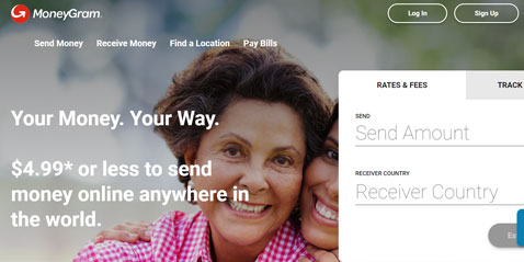
That was the biggest challenge we faced when we recently undertook a redesign of the MoneyGram.com online platform. We want to be at the forefront of digital expansion and continue to set the benchmark as industry leaders, but not at the expense of our customers. Everything we do has to keep them top of mind. So, the first order of business was to make sure that we delivered a user-friendly experience without a lot of unnecessary distractions. It all came down to ease of use and providing our customers with an immediate, streamlined solution that would appeal to even the newest digital consumers.
If you go to the site, you’ll see that we’ve made it more intuitive. There is a quicker navigation flow that basically provides a step-by-step process. You can instantly check on rates and fees and the site will walk you through the transaction from there. In addition to this prominent feature, we’ve also added an easily identifiable live chat button just beneath it to the right. That way if there’s any confusion, or if a user has any additional questions, one click connects them to the help they need right away.
Once customers feel more at ease about using these features, they can then begin to branch out and explore other areas of the site at their own pace. These sections include additional money transfer options, a store locator, transaction history and a rewards program to keep them coming back. Much like the recently launched MoneyGram app, we want this to be an engaging experience that feels less like a transaction and more like a direct relationship. We truly care about our customers and this site serves as an extension of our customer commitment. It’s not about providing a static online platform, it’s about showing our customers that there are actual people here for them whenever they need us.
At the end of each transaction, we allow our customers to send us feedback. We receive thousands of feedback responses on a weekly basis. We use machine learning, AI-based software to analyze each and every piece of feedback, categorize them and review them in order to improve our site with every new release.
Our business is ripe for new technology. Not too long ago, we had just one website here in the U.S. Now in two short years, we’re live in 25 countries with our online platform, appealing to a younger audience and helping to ease a cash-based generation into the digital age. I’m excited about what the future holds and look forward to using the website as a hub and a launching pad for our expanding digital channels. Stay tuned, we’re just getting started.